
In a world saturated with advertising and visual clutter, signage remains one of the most impactful tools for grabbing attention and driving customer action. Whether on the high street, at a retail shopfront, or inside an exhibition stand shell scheme, signs play a vital role in communicating a brand’s message. But effective signage does more than inform—it engages, persuades, and converts. In this blog, we explore the key principles and techniques that go into designing signs that do more than stand out—they create measurable engagement.
Understand Who You’re Speaking To
You must think beyond the visuals and focus on psychology, behaviour, and needs. Ask yourself:
- What is the age group of your target customers, and how do they consume visual information?
- Are you targeting passers-by on foot, drivers, or people browsing inside an exhibition hall?
- What tone of voice and imagery will evoke the right emotional response?
When you have a clear sense of your audience’s expectations and preferences, your sign printing becomes a strategic tool rather than just visual decoration.
Clarify the Purpose of the Sign
Effective signage always starts with purpose. You must determine whether the sign is designed to:
- Direct traffic to a location
- Promote a product or special offer
- Provide information, such as operating hours or event schedules
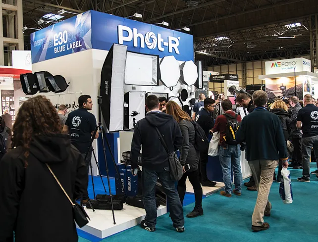
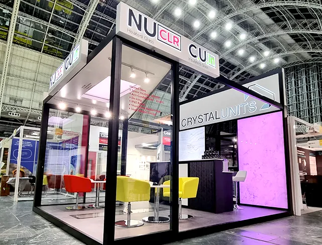
- Reinforce brand identity within an exhibition stand shell scheme
Once you define the goal, every design decision becomes clearer. It helps you determine size, copy length, placement, and even the ideal call-to-action.
Keep the Message Short, Clear, and Actionable
Your sign has only a few seconds to make an impression. That’s why clarity and brevity are essential. The most effective signs communicate a message instantly and require no additional explanation.
Use these key tactics:
- Limit text to one primary message or call-to-action
- Use high-contrast colour schemes to enhance readability
- Make your headline large and bold, followed by a smaller subheading
- Include a clear next step, whether it’s “Visit us at Stand A4” or “Call now for bookings”
Avoid trying to cram in every detail; signage should prompt action, not explain everything.
Use Visual Hierarchy to Guide the Eye
Visual hierarchy is how the viewer’s eye moves across the sign. Proper use of typography, colour, and spacing helps your audience process information effortlessly.
Key visual hierarchy tips include:
- Position your main message at the top or centre
- Ensure that the most critical information is readable from a distance
- Avoid overloading the design with logos or secondary graphics
This approach is especially useful in environments such as exhibitions, where a visitor may only glance at your signage for a split second.
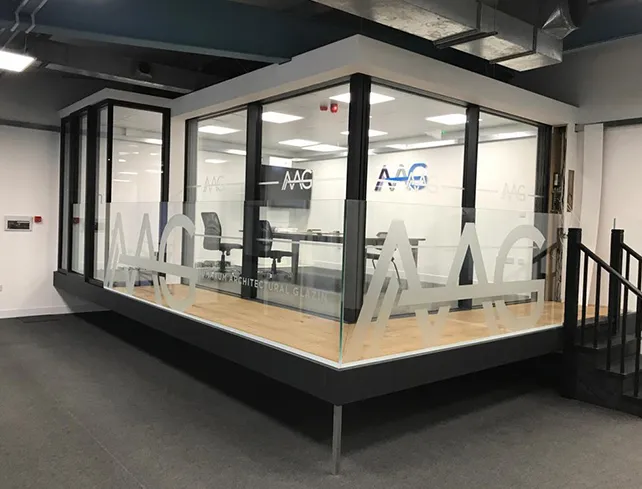
Stay On-Brand at All Times
Your signage must be a visual extension of your brand. Whether it’s part of a retail display or an exhibition stand shell scheme, consistency builds trust and recognition.
Use brand elements such as:
- Specific colour palettes and logo placement
- Consistent font choices and design style
- Brand taglines or slogans when appropriate
Off-brand visuals can confuse or alienate your audience. Sign printing should never be viewed in isolation from your overall branding strategy.
Leverage Colour and Contrast for Impact
It influences perception, emotion, and even decision-making.
Here’s how to use colour wisely:
Choose colours that align with your brand identity but also ensure visibility. These principles apply whether your sign is part of permanent retail signage or temporary sign printing for a one-off event.
Integrate Compelling Visual Elements
Strong visuals can boost message retention and increase customer interaction. You can enhance engagement by integrating:
- Icons that represent action or benefits (e.g., phone, calendar, arrow)
- Photographic elements that reflect your product or service
- Graphics that support the message instead of distracting from it
Where relevant, interactive elements like QR codes or NFC tags can bridge the gap between physical and digital engagement, encouraging the user to explore more.
Don’t Forget the CTA: Call-to-Action
A sign without a purpose is simply a decoration. Whether it’s a sales message or informational update, the sign must drive an outcome. Your call-to-action should:
- Use strong, action-oriented language such as “Buy Now”, “Visit Us”, or “Find Out More”
- Be placed prominently on the sign
- Lead to an easily achievable action (such as scanning a QR code or walking into a booth)
Even with beautiful design and perfect colour usage, your signage may underperform without a clear and visible CTA.
Choose Materials That Match the Environment
While design gets all the attention, material choice is just as critical in determining the lifespan and effectiveness of a sign. Indoor signs differ dramatically from outdoor or portable options.
Consider the following:
- For outdoor signs, materials must be weatherproof and UV-resistant
- Exhibition signage should be lightweight, transportable, and easy to install within shell schemes
- Retail window signs might need static clings or removable adhesives
Consulting with professionals helps you choose materials and finishes that support both form and function.
Use Strategic Placement to Maximise Visibility
Even the best-designed sign fails if it isn’t seen. Effective placement is all about understanding sightlines, behaviour flow, and customer habits.
To get placement right:
- Place directional signs near entrances, lifts, or major walkways
- Use signs to guide visitors through your exhibition stand shell scheme.Consider lighting, reflections, and competing visuals when positioning signage
Sometimes a small sign in the right location outperforms a large sign that’s poorly placed.
Review, Test, and Update Regularly
Effective sign design is rarely a one-time effort. Brands that treat signage as a dynamic part of customer engagement tend to outperform those that don’t.
Here’s how to optimise continuously:
- Test different versions of signs with A/B layouts or messaging
- Use foot traffic monitoring or heat maps at exhibitions to track effectiveness
- Solicit direct feedback from customers about sign clarity or impact
- Update designs periodically to reflect promotions, seasons, or product updates
Conclusion
By understanding your audience, focusing on clarity, applying branding, and selecting the right materials and placement, you can significantly enhance how customers perceive and interact with your business. Whether it’s part of an intricate exhibition stand shell scheme or a straightforward retail promotion, the principles of engagement remain the same—clear messaging, strong visuals, and strategic design. For expert guidance in creating high-impact signs that connect with your audience, Sign Company London offers comprehensive solutions tailored to meet your brand’s objectives.